السامرية — خلّي البيض يبان كمنتج فاخر
“قمت بتصميم صفحة هبوط تركز على التحويل لـ 'السامرية' — وهي علامة تجارية قطرية فاخرة للبيض — حولت منتجاً عادياً إلى تجربة طعام صحي فاخرة من خلال التصميم المرئي العضوي، والتموضع الصحي للأوميغا-3، وقصة العلامة التجارية القائمة على التصفح التي جعلت المستهلكين يختارون السامرية على كل كرتونة عادية على الرف.”
الدور
LANDING PAGE · FOOD BRANDING · QATAR
التقنيات
WordPress, Elementor, Custom CSS, Custom Illustrations
تاريخ الإنجاز
2023

القصة
النظام التقني
المشكلة
منتج فاخر محاصر في سوق السلع العادية
نقاط الألم الرئيسية
- مفيش حضور رقمي لمنتج فاخر — فكانت الميزات الصحية موجودة، لكن مش ظاهرة بشكل يخلّي العميل يستوعب قيمتها بسرعة
- ماكانش فيه نظام بصري يشرح الفارق بين المنتج والبدائل العادية بشكل فوري ومقنع
- العميل اللي بيدوّر على منتجات صحية عالية الجودة ماكانش عنده نقطة دخول رقمية تساعده يتعرّف على المنتج أو يثق فيه بسرعة
الحل
بناء تجربة بصرية تترجم الجودة إلى قيمة مفهومة
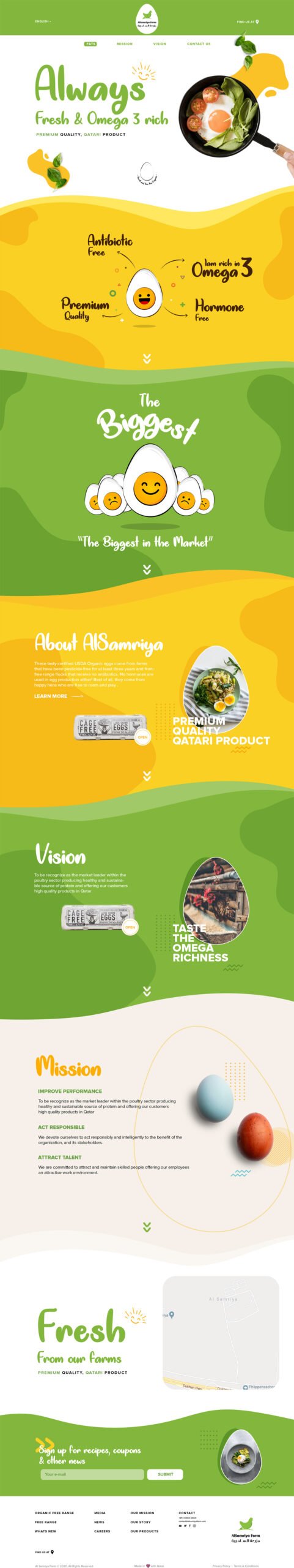
Hero بصري واضح ونظام ثقة سريع
صممنا Hero كامل المساحة بصور منتج بارزة، وعناصر بصرية توضّح النقاط الصحية الأساسية بشكل فوري، مع خلفيات عضوية تربط بين النقاء والجودة.
قسم تمييز المنتج
بنينا قسم يوضح إن المنتج له نقطة اختلاف حقيقية، مع نص مباشر وصور داعمة تخلي الرسالة سهلة التذكر وقت الاختيار.
قصة العلامة من المزرعة للمنزل
أضفنا قسم يشرح الأصل، الجودة، وطبيعة الإنتاج بشكل يربط المنتج بمصدره ويقوّي الثقة في العلامة.
إحساس بالشفافية والجودة
استخدمنا صورًا دافئة للمزرعة وعناصر تصميم طبيعية علشان ننقل إحساس الواقعية والثقة من غير مبالغة.
التقاط الجمهور المهتم
بنينـا مساحة تواصل بسيطة وواضحة تربط الزائر بالعلامة بعد أول زيارة، وتفتح باب علاقة مستمرة خارج لحظة الشراء.
برهان مرئي
Full Landing Page — Organic Brand Experience
“لم يصمم أحمد موقعاً إلكترونياً فحسب — بل صمم شعور الناس تجاه بيضنا. الأشكال العضوية، والرسائل الصحية، وقصة المزرعة — كل شيء جعل منتجنا يشعر بالفخامة. بدأ تجار التجزئة يطلبون منا رابط صفحة الهبوط لمشاركته مع مشتريهم.”